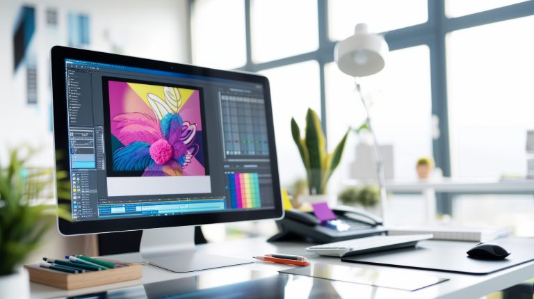
Creating a logo is a process that includes research, planning, and execution. First, you need to understand your brand and what you want your logo to represent. Once you have an interesting idea, you can start playing around with different design concepts. Once you have a few concepts you like, you need to test them out and see how they work in different situations. After that, you can choose the best one and start using it.
When considering your branding design, here are factors that make a good logo:
The Font
Your font choice will affect how your logo looks, so it’s important to be thoughtful about your decision. There are usually four kinds to choose from:
- Sans serif: These are fonts without tails and are typically used for body copy because they are easy to read. They can also be good logo options, as they can be read at any size.
- Serif: These fonts are perfect for any business that wants to come across as professional and modern. The small lines make the letters easy to read, and the elegant design creates a sophisticated look.
- Script: Handwritten fonts can add a personal touch to your design. They often work well with hand-drawn logos or other design elements.
- Display: These fonts are eye-catching and decorative rather than practical for body copy. They can be a good choice for headlines or short texts if you want to make a bold impact.
The Colour
The logo’s colour is important because it represents your brand design. You should choose colours that match your brand’s personality, values, and identity. If you have trouble picking the correct colours, you can use a colour wheel to see the available combinations.
The Shape or Form
Your logo’s shape should be based on what your brand represents. If your brand is playful, choose a shape that is also playful. If your brand is serious, choose a shape that is also serious, etc.
You can create a logo that is unique to your company by choosing a shape that represents your company or by selecting a shape that will make your logo stand out. You can also choose a shape that is interesting and eye-catching. Remember that you can use any shape in your logo design, but you should be careful when combining two different shapes that don’t go well together.
Organisation
When creating a visual hierarchy, you must first determine the most important part of your logo. This could be your company name, tagline, or overall message. Once you know what you want to highlight, you can begin arranging your other graphic elements around it.
Some ways to create a visual hierarchy include using size, colour, and negative space. You can also use more than one of these methods to make your logo pop. For example, you could make your company name the largest element and use a bright, eye-catching colour. Or, you could use negative space to draw attention to your tagline.
No matter what methods you use, highlighting the most important parts of your logo ensures that your audience will see what you want them to see.
In Summary
Always design a logo from a big-picture perspective. The collateral will be seen in all marketing efforts, so remember these factors the next time you design.
Contact Studio Lore immediately if you want to up your branding design game! Our creative team brings your organisation’s vision to life through modern visual storytelling. Book your free 30-minute strategy session via our website, email (hello@studiolore.com.au), or call us at 03-7035-3921!


